5 website updates that can help impact your sales.
User experience, or UX, impacts how customers navigate your website, find the products they’re looking for, and ultimately complete a purchase. When users find that experience to be fast, easy, direct, and even enjoyable, there’s a better chance they’ll buy from you instead of your competitors. On the flip side, if your UX frustrates or confuses shoppers, expect them to go elsewhere.
While some UX improvements require a lot of resources, the five tactics that follow are easy to implement and have paid off for businesses in all kinds of industries, from apparel to healthcare and even home improvement.
1. Create a more prominent and attention-grabbing call to action (CTA).

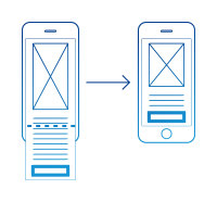
Content placed at the top of a page, before anyone needs to scroll down, is seen 84% more than content placed “below the fold,” or content that requires users to scroll down to see it.1 So take a quick peek at your homepage — is your CTA hiding at the bottom? If it is, try moving it toward the top, where users can see it once they land on the page. Better yet, put your CTA at the top and bottom of the page, or make it "sticky" so it follows the user as they scroll down the page.
In addition to being immediately visible, your CTA should also grab users’ attention. Test a few enhancements like font size or colour and see which CTA generates the most clicks.
“I was curious whether colour would impact user behavior, so I chose a colour for the CTA that contrasts the colour of the main landing page,” says Sam Malik, founder of the UK-based online pharmacy Dr Felix. “It’s an easy thing to implement and I saw a bump in conversions and more visitors clicking on in the CTA to go past the main landing page.”
2. Make your products easy to find.

A hallmark of great UX is uniting users with what they’re looking for as quickly as possible. “If they click on a product and it’s not exactly what they’re looking for, you'll end up with frustrated users and a huge bounce rate,” says Kevin Stewart, senior UX designer at automotive website LeaseFetcher.com.
Using filters can make this process fast and efficient. “At LeaseFetcher, we added a range of product filters—fuel efficiency, doors, transmission, rating, popularity, fuel type, etc.—so users could find cars that met their specific requirements,” says Stewart. “After implementing the new filters, we saw a significant fall in the bounce rate on the car page and a huge fall in site-wide exit rates.”
While you’re making changes to your product filters, also take a look at how you’re naming product categories. Ask: Is the naming intuitive? Would most of my shoppers easily understand where to click to find the item they’re looking for? If there’s even a slight doubt, test your website out on platforms like UserTesting.com to get user feedback.
3. Streamline your checkout experience.
A faster, easier checkout process is a no-brainer when it comes cultivating higher checkout completions. Your first step: examine potential roadblocks to users completing purchases.

“We had a few comments from customers who expressed trouble in completing the checkout process because their address was not recognized as part of the autofill feature,” says Greg Bullock, marketing manager at TheraSpecs, an eyewear company. “This inspired us to remove it and evaluate the impact. We observed a direct 12% improvement in the conversion performance of our checkout page in the first four weeks after the change.”
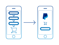
You can add a simplified option like PayPal Checkout to provide customers with multiple payment options and save them the hassle of having to enter shipping information. “By allowing customers to use delivery and billing information that’s already stored on their PayPal account, we’re preventing them from having to re-enter the same details on our site, making the whole checkout flow much quicker and easier to complete,” says Andy Halliday, SEO manager at home improvement retailer VictoriaPlumb.com.

4. Increase your font size.

This may seem obvious but if users have a hard time reading information on your site, you could be cheating yourself out of sales. Experts recommend a font size of at least 16 pixels for responsive websites2, as larger fonts improve UX readability and reader comprehension3. This explains why default font sizes for search engines usually hover around this mark. Luckily, changing the font size on your landing pages is typically a quick and inexpensive fix.
5. Tailor your site experience using analytics insights.

Use tools like Google Analytics to get an overview of user demographics and traffic sources to your website. “I noticed almost 70% of our visitors were using smartphones,” recalls Dr Felix’s Malik. “So I created a new mobile menu and optimised the site for mobile users as a priority and saw an increase in sales.”
For an in-depth look at how customers are behaving once they get to your site, try tools like Hotjar, Crazy Egg, and Inspectlet. These platforms record user sessions and provide easy-to-digest analytics in the form of heatmaps that show where users scroll, click, and focus their attention.
Once you’ve spent time learning about your customers, act on those learnings. “A great way to leverage customer data is through the use of A/B testing,” says Darren Schreher, digital manager at clothing retailer INTO THE AM. “If you’re able to compare two versions of a webpage, you can determine which one performs better. Continuous testing and optimisation ultimately lead to a better user experience.”
A great UX encourages your customers to take action.
As successful ecommerce businesses can tell you, optimising the user experience on your site doesn’t need to take a huge chunk of your time or budget. The little things you do to improve your customers’ journey, from experimenting with simple style tweaks to collecting customer data with a single line of code, have the potential to boost sales, sign-ups, and downloads in a big way.
Click here if you would like to speak to someone in Vietnamese.
1Source: Nielsen Norman Group. The Fold Manifesto: Why the Page Fold Still Matters. February 1, 2015.
2Source: Learn UI Design Blog. The Responsive Website Font Size Guidelines. April 23, 2018.
3Source: Make It Big! The Effect of Font Size and Line Spacing on Online Readability. May 2016.
We’ll use cookies to improve and customize your experience if you continue to browse. Is it OK if we also use cookies to show you personalized ads? Learn more and manage your cookies